DexWinBet
● shipped
Mobile & Web
Product Design
Revamping a crypto betting platform to increase retention and betting conversion
As the second Product Designer on the team, I redesigned the dashboard and onboarding & transaction experiences, resulting in a 2x organic conversion within six months
TEAM
1 Product Designer (me)
1 Junior Product Designer
1 Lead Product Designer
4 Developers
ROLE
Product Designer
TOOLS
Figma
Midjourney
Photoshop
PLATFORM
Web Application
Mobile Application
TIMELINE
6 months+
IMPACT
01.
Clear and prominent CTAs
02
Improved filtering across sports for faster navigation
03
Strong information hierarchy for better scanability

01.
New In-House Wallet
I designed a simple native wallet experienceto eliminate reliance on external wallet setup, reducing 7+ steps and simplifying how users deposit, withdraw, and track funds.
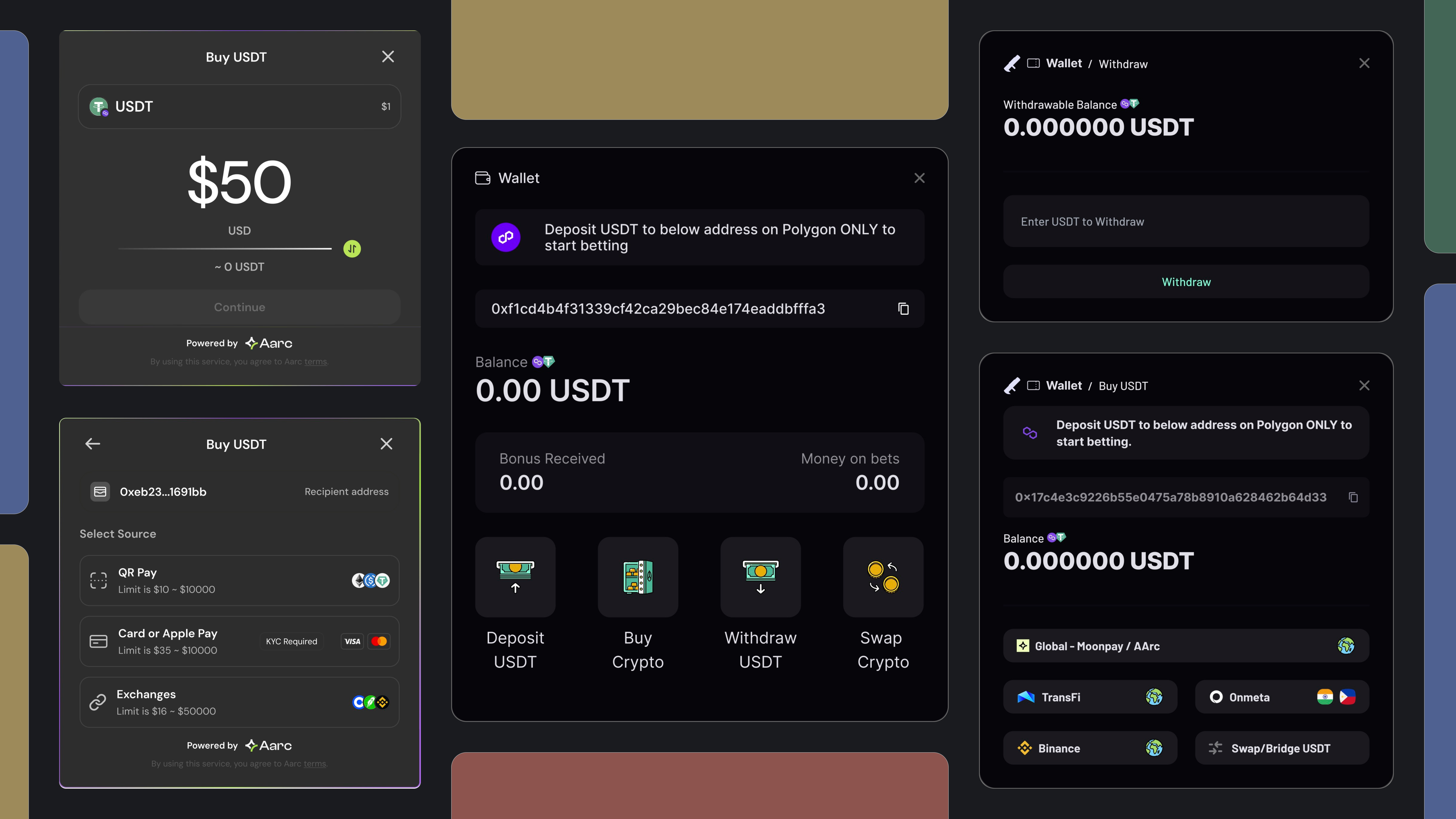
The New Experience
02 Onboarding & Transaction
02
Simplified Onboarding
I streamlined onboarding to support both crypto-native and non-crypto users, making account setup more accessible across different experience levels.

Research
Identifying Revamp Strategy
As the product moved toward a full revamp, growth stagnation, inconsistent visuals, and scalability issues prompted a deeper understanding of what was going wrong. I drove the research side of things, keeping in mind the limited resources the startup had.
MULTI-METHOD
01.
Behavioral Analytics Study [HotJar & Google Analytics]
I analyzed Google Analytics and Hotjar recordings to understand where users were dropping off and how they navigated core flows.
02
Qualitative Interviews [Crypto & Non-Crypto Users]
I conducted interviews with both crypto-native and non-crypto users to understand differences in mental models and expectations. Crypto-native users lacked excitement with the platform, while non-crypto users struggled with the multi-step wallet setup.
Findings
Product Problems
Dexwin’s growth had plateaued, with low engagement across key metrics. The product also lacked the structure needed to support new verticals and scale well
<10% : Consistently low DAU/MAU
High bounce rates among new users ~78% before placing bets
Product was not scalable to support Casino and Fantasy expansion
Outdated visual style : hadn't been updated since its first conception
User Problems
User Problems
I found that users faced friction at key steps in the journey, especially before placing their first bet. These issues directly contributed to high drop-off and low activation
Unclear entry points, overall lack of trust
60%+ of new users dropped off during external wallet creation, accounting for the largest share of pre-bet abandonment
Lack of incentives to drive betting excitement
Design Direction
Identifying Revamp Strategy
After identifying problem areas, the team defined key areas of focus to scope the revamp and distribute work across the product. I worked on the redesign of the dashboard and onboarding + wallet flows, touching on visual design, while the broader system was extended to support new gaming verticals and promotions design.
01
Visual Design
To lay the foundations of a new visual design system that would align with product 'look and feel' goals while ensuring easy scalibility.
02
Dashboard Design
To improve information hierarchy, make the experience easier to navigate and delightful while remaining scalable for promotions.
03
Onboarding & Wallet
To reduce friction during account setup, eliminate unnecessary steps in wallet creation by setting up an in-house wallet.
04
New Gaming Verticals
To create a scalable system that could support Casino, Fantasy, and expanded betting features.
Dashboard Design Process
Landing pages : Pre and Post-Login

Problems with the current Dashboard
Hard to scan - cognitive load
As pointed by users and a comprehensive audit I conducted, poor use of screen real estate and weak visual hierarchy was making it difficult to scan the dashboard.
Unintuitive filter toggles between sports and categories
Multi-level toggling (sport → league) was badly designed making me dig deeper into extablished interaction patterns
Not Scalable for promotions
The current layouts weren't dynamic and made it difficult to integrate promotions and ads.
Wireframing new IA
Layout Exploration 01
I defined navigation patterns and information hierarchy before building new components. I Guerrilla tested these layouts for overall usability among research participants and internally.
WHY THIS DIDN'T MOVE FORWARD
★
Horizontal league filteration was slower
While this structure improved scanability, it retained a sequential interaction model (sport → league). Users still had to navigate up to filter specific leagues, which slowed down access. I wanted to explore a persistent side navigation for faster league selection.

The New Experience
Layout Exploration 02
WHY THIS WORKED BETTER
★
Reduced reliance on horizontal scanning
I explored a combination of horizontal and vertical navigation heirarchy. This direction worked better by introducing persistent league navigation, allowing users to access specific leagues more directly. It reduced reliance on horizontal scanning and made filtering more efficient.

Designing Building Blocks
Layout Exploration 01
I collaborated with the senior designer to build a simple visual system that would be easy to scale in the future.
★
Visual Elements and design language
Over multiple design sprints and alignment cycles with leadership, the design team established a visual foundation and component system. I drove the visisn for the visual system on a high-level, stressing on analog accents and modern typography to create brand distinction. The system was futher polished as a team activity.

Integrating building blocks into the wireframed layouts
As I developed the wireframes, I began integrating the building blocks in parallel, using them to structure the dashboard into well-defined regions. I focused on establishing a strong visual hierarchy and balanced visual weight so that no single element dominated attention. This helped reduce cognitive load, making the interface easier to scan.

Scalable layouts to include ads and promos
Layout Exploration 01
I designed scalable dashboard sections so promo cards could be integrated without disrupting the experience, supporting engagement and incentives. I used Midjourney AI to create promotional cards and ads as we lacked a dedicated team to create visual assets. I then established sizes and tones for these cards to understand how they would fit within the dashboard.


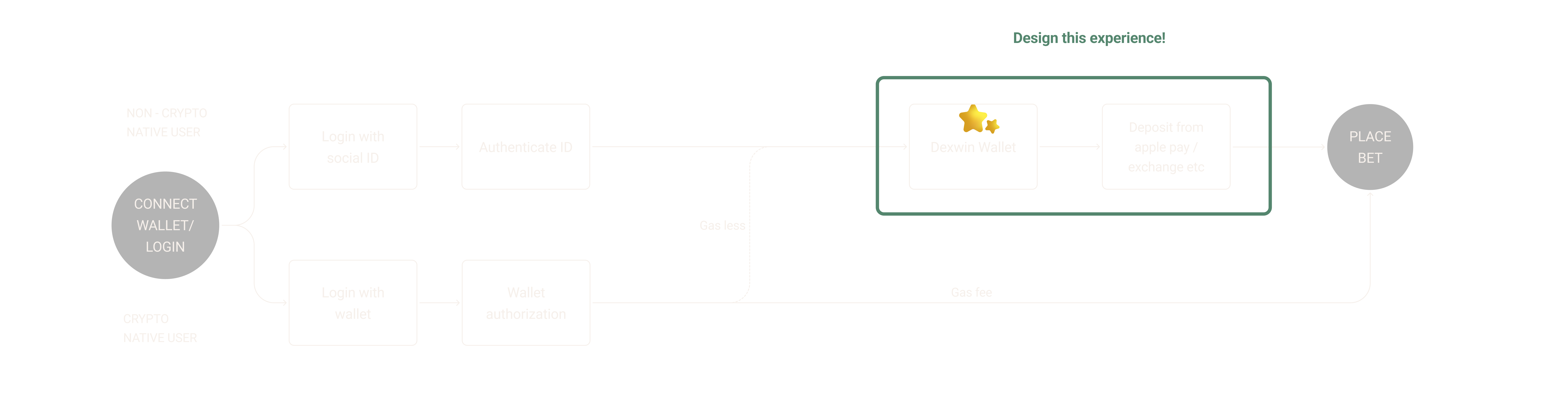
Onboarding & Transaction Experience
Landing pages : Pre and Post-Login


The Problem
External wallet creation
★
Onboarding new crypto users was difficult due to a high number of steps and reliance on external wallet creation. Before placing a bet, users were required to leave the platform, set up a wallet, and complete multiple actions, creating friction early in the journey. External wallet setup introduced 7+ steps before users could fund their account, breaking the flow and experience.

Why external wallet creation was used?
Layout Exploration 01
Reduced risk and faster implementation
Dexwin relied on external wallets due to the complexity and risk of handling crypto assets on-platform. Building an in-app wallet requires secure handling of private keys, including storage, encryption, and recovery. Using external wallets allowed the team to launch faster without building full wallet infrastructure.
Introduction of the in-house wallet
Layout Exploration 01
Making crypto wallets creation feel like logging into Gmail without compromising on security was one of our toughest technical and design challenges.
External wallet flows were a major source of drop-off and friction requiring users to leave the platform and complete multiple steps before depositing funds. This broke momentum at a critical point in the journey. As the product matured and more resources became available, the team invested in stronger backend capabilities, making it feasible to move to an in house wallet and take control of the experience end to end.
A new user journey
Designing an under the hood experience
★
As a starting point, I mapped out the new user journey to understand how the wallet would fit into the experience and identify the features it needed to support
The Wallet
Feature Mappping
★
To replace external wallet dependency, I had t omake sure the in-house wallet needed to support the core capabilities of a standard crypto wallet while remaining simple enough for non-crypto users. I started by mapping out the essential features required to make the wallet functional. I studied beginner-friendly wallets like Metamask and Rainbow Wallet to understand information hierarchy and functionality.

Prototyping & Iteration
Earlier versions
I created rapid prototypes and tested them with the team and research participants.
WHY DIDN'T THIS WORK?
★
The first version I prototyped used a top-aligned segmented tab to organize wallet actions. I made this decision to make switching between deposit, withdraw, buy, and swap intuitive. The toggles updated the available options under each section. However, the on-ramp and off-ramp third party integrations required to support these actions involved merging external UI patterns with the existing interface, which was not possible. The neutral state of the wallet needed to remain free of any third party integrations. After getting feedback from the team, I set out to explore a direct approach.

Final version
WHY THIS WORKED?
★
In this version for deposit, withdraw, buy, and swap - instead of switching between tabs, I designed each action to be clickable, leading to a dedicated flow. This approach made it easier to integrate the on-ramp and off-ramp as separate flows, without forcing external UI into the main interface. By moving these into controlled entry points, I ensured the experience remained consistent while still supporting third-party interactions.

Design Tradeoff
★
On-ramp and off-ramp flows relied on third party interfaces at L2/L3, which introduced some visual inconsistency within the wallet experience. After many trials, I concluded that these flows cannot fully align with the product’s design system.
Why it didn’t matter
This inconsistency was limited to specific transaction steps and did not affect the core wallet experience. More importantly, using well known third party providers improved trust during financial actions and ensured reliable transaction handling.
Why it was successful
I prioritized clarity, speed, and user confidence over complete visual consistency to ensure the experience remained effective and clean where it mattered most.

Impact
Layout Exploration 01
METRICS
$792 ↑ in ARPU
The platform saw a $792 increase in Annual Revenue Per User after the initial revamp. Following this, the product continued to evolve through ongoing iterations and targeted design improvements.
7->27% ↑ in DAU/MAU
The sticky ratio increased owing to the revamp, aggressive marketing strategies in user-dense regions like the Philippines and Taiwan.
2x organic conversation rates
The revamp led to a 2× increase in organic conversion and expanded the platform’s reach to new users across Europe and Africa.
Reflection
Layout Exploration 01
WHAT DID I LEARN?
Navigating ambiguity in a new domain
I started with a limited understanding of crypto systems, which made early decisions harder and slower. I spent time learning independently, asking basic questions, and working closely with engineers to understand how things actually worked which helped me develop more confidence in my design decisions.
Designing for trust in high-risk environments
Working on financial and crypto flows made it clear that small UX decisions directly impact user trust. I focused on clarity, feedback, and accessibility when designing transactional flows. Limited resources meant holding back on forcing visual identity in these areas earlier on.
Design is design
I learned to bend my design instincts to fit the needs of the system. More importantly, it shifted how I see myself. I was not just creating interfaces; I was solving problems, making decisions aligned with user and business needs. Working in this space also opened up the world of web3 for me, expanding my understanding of how connected systems operate beyond traditional interfaces.
It broadened my perspective on emerging technologies and how they shape user behavior.
Reflection
What would I do differently?
✨ Fin. Want to know more? Email me @husnatabassum7@gmail.com